Repeat Roses
The Challenge
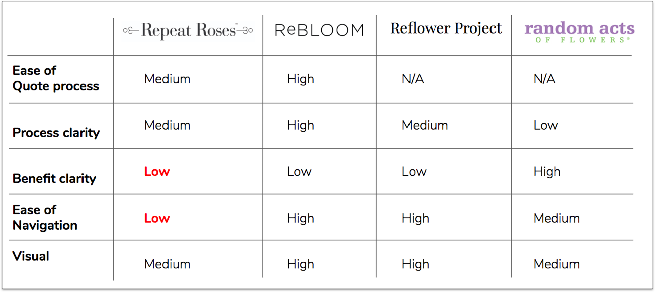
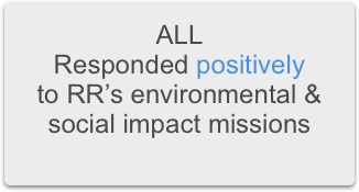
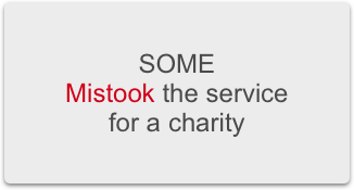
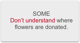
User Research & Analysis
Personas & Customer Journey Map
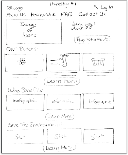
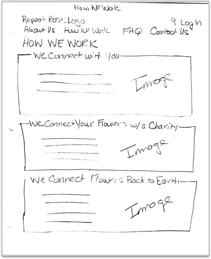
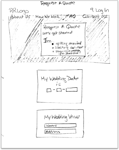
Design Approach, User Flows, Sketches
Wireframes, Usability Testing, Prototype
Summary
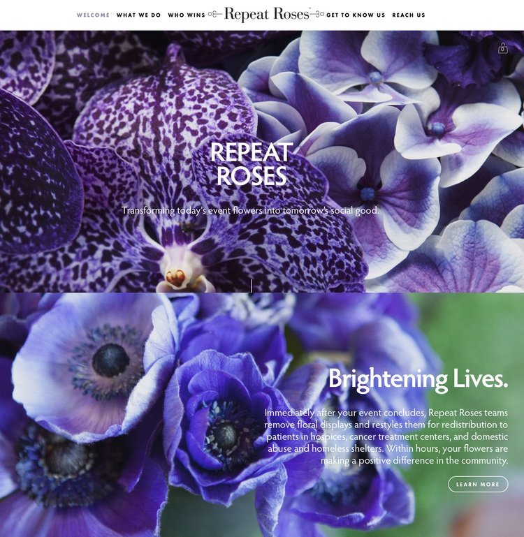
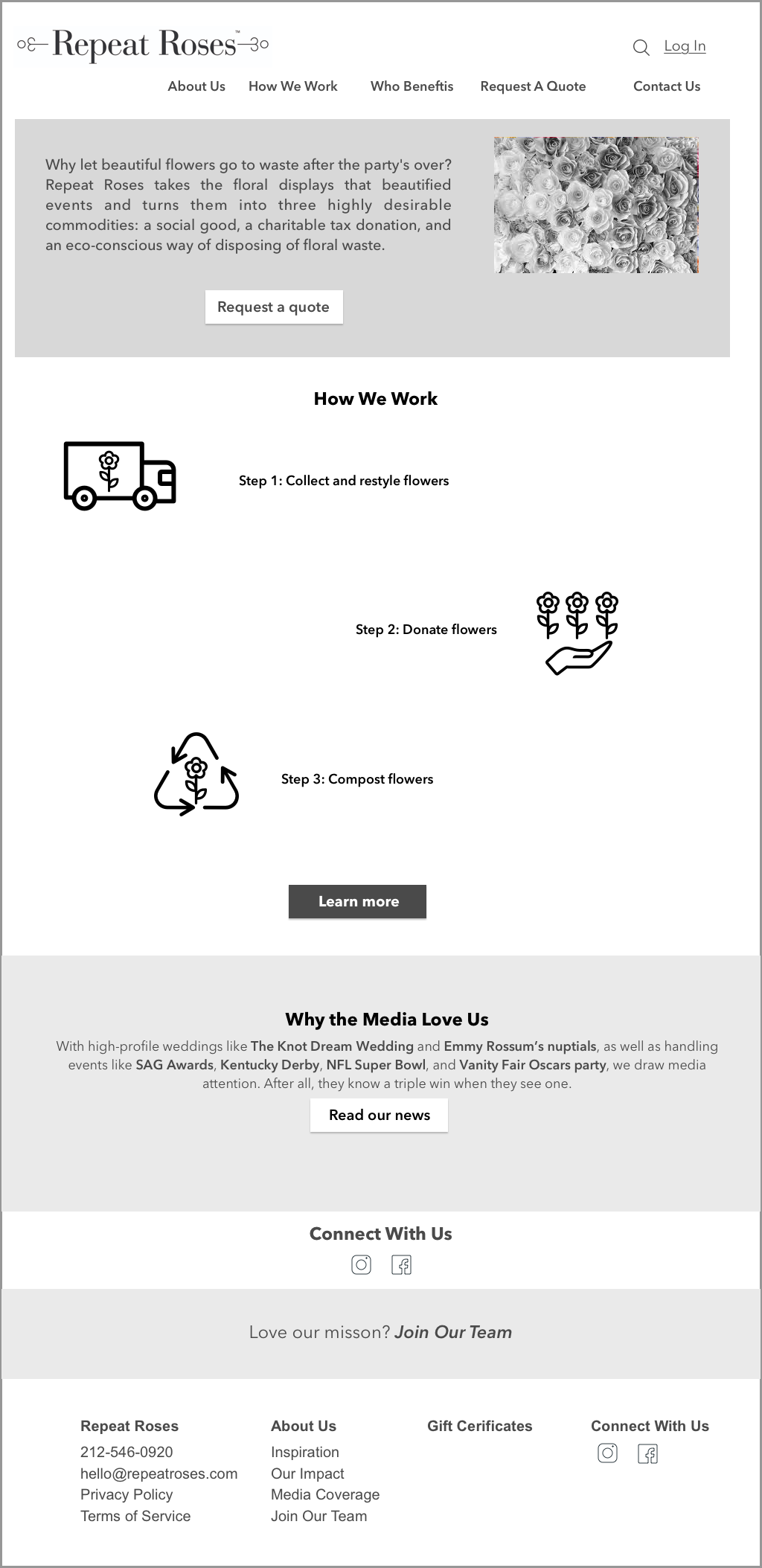
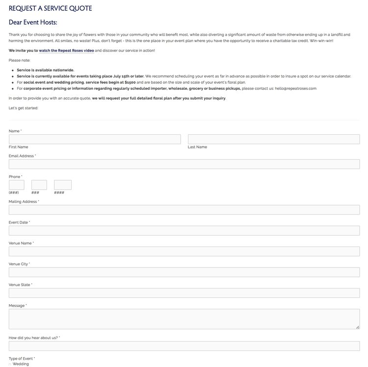
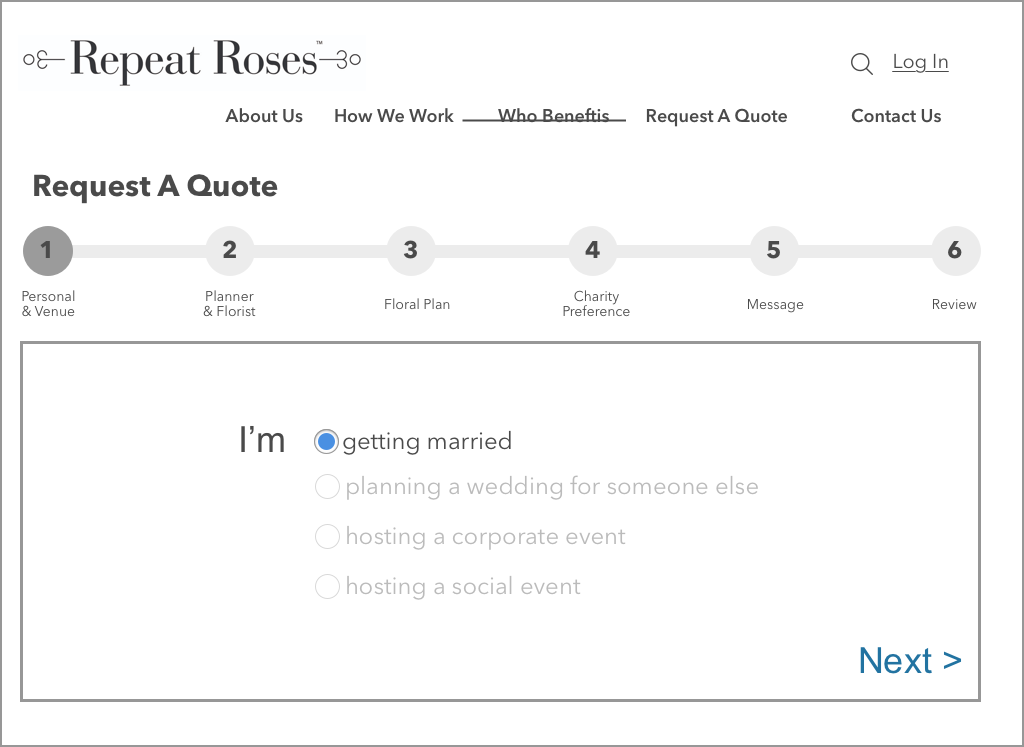
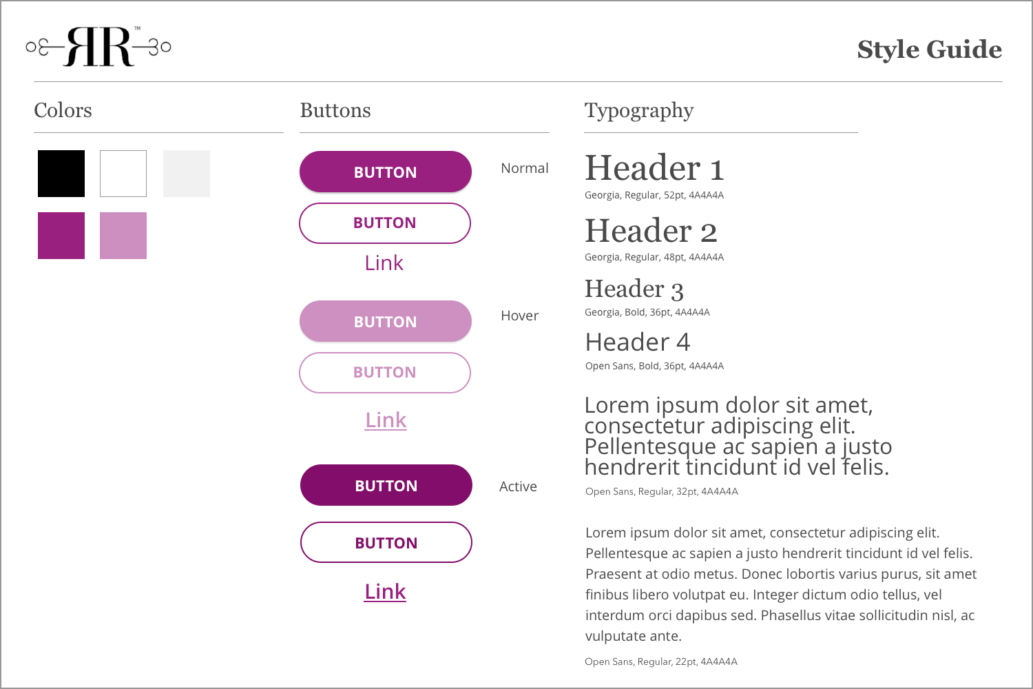
The project with Repeat Roses was an opportunity for me to be part of a design team and help redesign this
social and environmentally conscious company’s client facing website.
It was fun to collaborate with other designers and work through the entire UX process
from user discovery to prototype!
Takeaways
I came away from this project with a stronger understanding how the entire UX design process works including
user research, user interviews and usability testing in which I was not directly involved on other design
projects. It was refreshing to be on a project from its inception to final mockup and prototype.
I also
learned how to work effectively on a design team, as the majority of the work I’ve done has been as a solo UX designer.