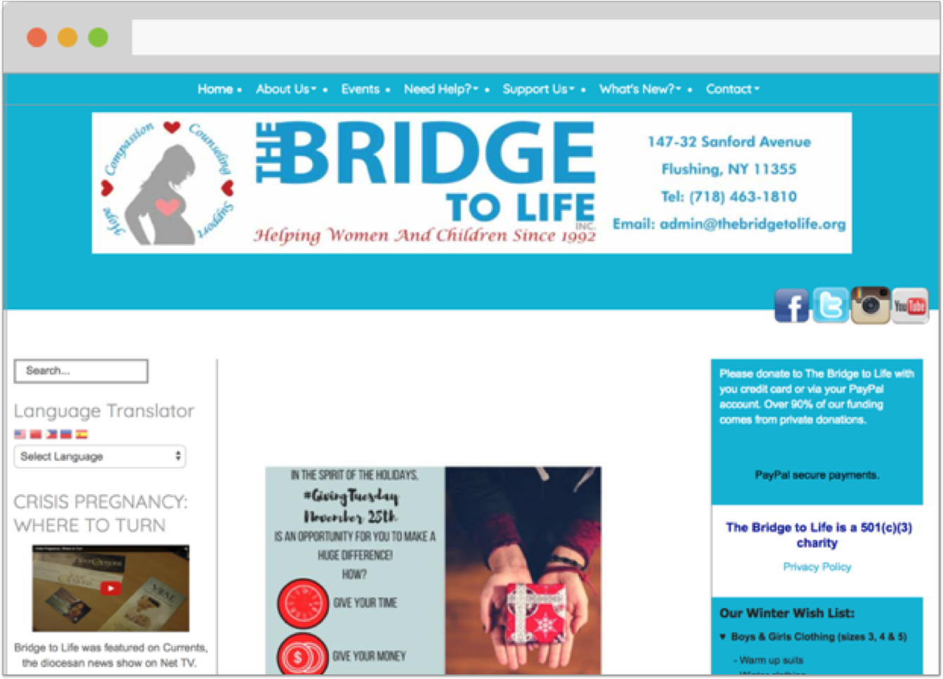
The Bridge to Life


Summary & Takeaways

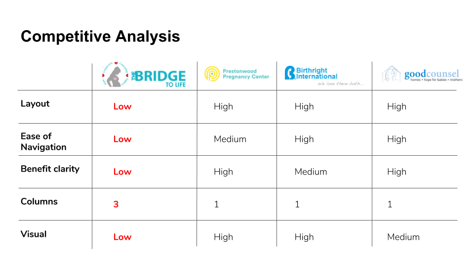
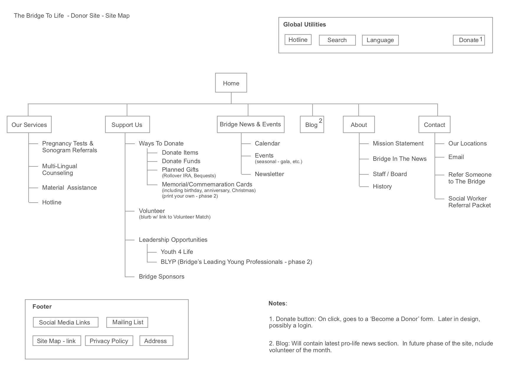
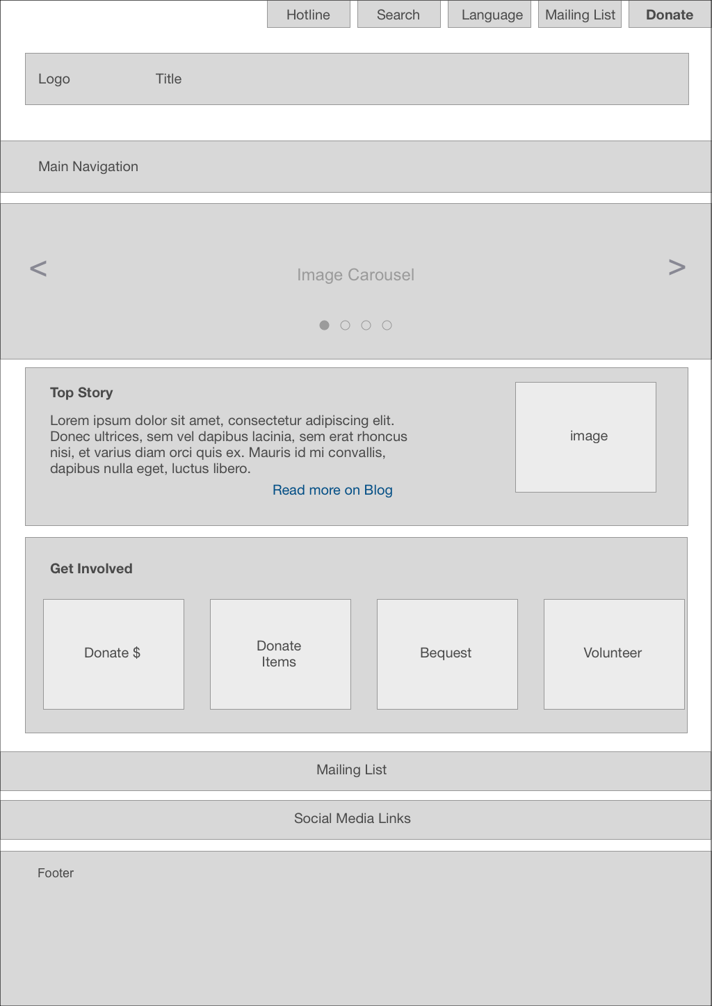
This project was a great opportunity for me to work on a site redesign from scratch. It challenged me to come up with a design strategy and UI that helped the organization better convey their services.

Results

One year after the redesign there is a 60% increase in unique visitors to the site!

But wait! There's more to the story! Find out here.

The Challenge

Challenge

I was tasked with the entire site redesign of this womens’ health center. I worked with the executive director and IT manager of the organization to come up with a new overall site structure as well as look and feel to match the center’s logo.

Client

The Bridge to Life is an non-profit organization helping women in health crises.

My Role

Competitive and comparative analysis, site maps, wireframes, mockups, prototype

Original Site

Their website desperately needed to be updated to appeal to the younger demographic they support. The site had a 3 column layout which made it difficult to understand what piece of content was most important to look at on the page.


Competitive & Comparative Analysis

After speaking with targeted, potential users of the site, I conducted a competitive analysis that revealed the need for a simplified, scrollable layout and navigation. Both the user interviews and the competitive analysis revealed that users of this service prefer a parallax, easily scannable site which Bridge's current three column layout did not provide.

Comparative Analysis

I investigated several companies that offer similar services as well as companies that provide an easy to scan site using a parallax design. One site in particular that provided much design inspiration was Spence-Chapin, an adoption service. Their navigation is clean and they prominently position their ‘donate’ CTA. They also use photogrpahy as their ‘hero’ view which prompts the user to scroll the rest of the page to learn more about their services.

Site Map

The site’s content needed to be reorganized and prioritized. I produced a site map and shared it with the client to lay out what content should go where on the site. We were then able to talk about the content that needed to be prominent and what content could be further developed in a second phase of the site.

Wireframes

Drawing the viewer into the site requires an emotional connection. That emotional connection can be easily made with pictures of women and men who are like them and are in the same demographic. Images are the first thing the viewer would see to encourage them to scroll further down the site to find out what Bridge can do for them in their time of need.

Mockups

The redesigned site simplifies the layout from three columns to an easy one column scrollable parallax format. It also separates the global navigation from the main page navigation.

Results

The Bridge staff were rejoicing after they learned that there was a 60% increase in unique visitors to their newly redesigned site!


And that's not even the most interesting part of the story. While the I was all set to see the complete prototype implemented by the developers, there was a little snag. The developers were able to deliver the site only within the WordPress platform. This wasn't the ideal vision, however, even having the site in WordPress still provided an increase in viewership.


A few months later, we were successful in transitioning the site to a new hosting service. At that point, I was able to upload the site pages that I coded in HTML/CSS reflecting the original site’s vision. Now the site is exactly what the staff approved and is no longer confined to the WordPress structure.